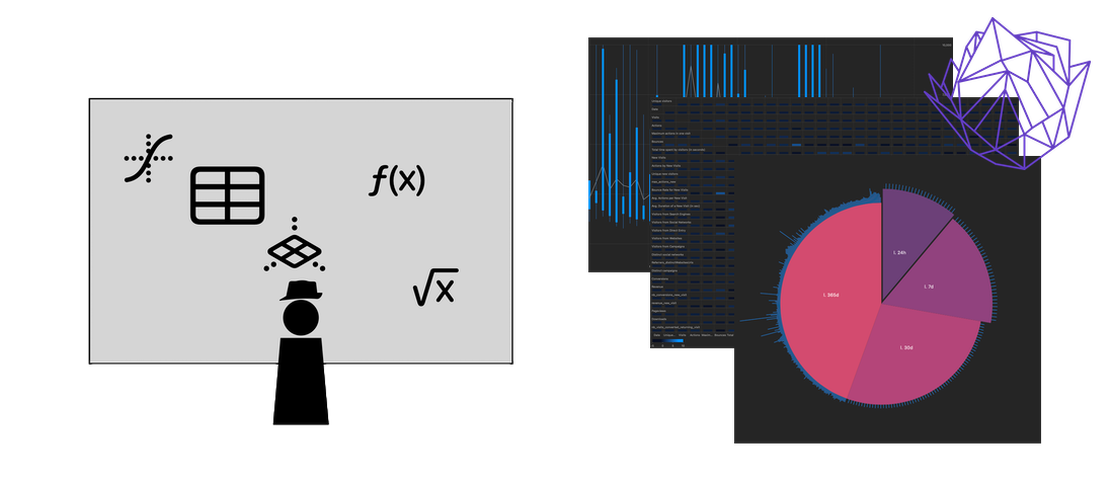
Visualizations
Overview
For every column in the dataset, visuzlize a few key indicators such as minimal and maximal values, average and mean, and mode(s) if they are numerical; a repartition of the labels if they are categorical, and a heatmap if they are dates. That way you can get a glimpse of the whole thing before digging in!
What it can discover: It will let you see if your data looks complete, or if something’s off, and help you choose which columns to focus on next.
Cumulative Analysis
Visualizes cumulative sums or deltas of numerical columns. Shows how values accumulate over row numbers or another selected column, helping identify trends and growth patterns in your data. Requires selecting a numeric column for Y, optionally an index column for X, and a mode (sum/delta).
What it can discover: Cumulative analysis reveals overall growth trends, identifies periods of rapid increase or decrease, and helps understand the total accumulation of values over time or another dimension.
Covariance Analysis
Displays covariance relationships between all numerical columns in your dataset. Uses color-coded matrices to visualize which variables move together, revealing correlations in your multivariate data.
What it can discover: Covariance analysis reveals which variables are positively or negatively correlated, helping identify which factors tend to increase or decrease together, and highlighting potential causal relationships worth investigating further.
Gaussian Distribution
Fits Gaussian (normal) distributions to your data and displays the probability density function. Shows mean (μ) and standard deviation (σ) parameters, helping you understand if your data follows a normal distribution pattern. Requires selecting one or two columns (X, or X and Y) and supports normalization.
What it can discover: Gaussian distribution analysis reveals whether your data follows a bell curve pattern, identifies outliers that deviate significantly from the norm, and helps determine if statistical methods assuming normality are appropriate for your dataset.
Polynomial Regression
Performs polynomial regression analysis with configurable degree (1-6). Displays fitted curves that capture non-linear relationships between variables, complete with mathematical equations and residual analysis. Requires selecting an X column, Y column, and degree (1-6).
What it can discover: Polynomial regression reveals non-linear patterns in your data, identifies optimal polynomial degrees for modeling relationships, and helps predict future values based on observed curved trends.
Probability Density Estimation
Generates smooth probability density functions using Gaussian kernel density estimation. Helps visualize the underlying distribution shape of your numerical data without binning artifacts present in histograms. Requires selecting a numeric column and a bin size.
What it can discover: Probability density estimation reveals the underlying distribution structure, identifies multiple modes or clusters in the data, and helps understand the likelihood of different values occurring in your dataset.
Rosewheel Timeline
Visualizes time-series data on a circular radial timeline. Maps dates around a circular path with value intensities as outward spikes, making seasonal patterns and cyclical behavior immediately visible. Requires selecting a date column for X and a numeric column for Y.
What it can discover: Rosewheel Timeline reveals seasonal patterns, cyclical behavior, and periodic trends that might be obscured in linear time-series charts, making it easier to identify recurring patterns over weeks, months, or years.
Time Series Analysis
Analyzes temporal patterns in your data using candlestick charts. Supports multiple granularities (hourly, daily, weekly, monthly) to reveal trends, seasonal patterns, and anomalies over time periods. Requires selecting a date column for X, numeric column for Y, and granularity setting.
What it can discover: Time Series Analysis reveals temporal trends, identifies anomalous periods with unusual spikes or drops, and helps understand how values change over time across different time granularities.
Clustering
Performs K-means clustering analysis on two-dimensional data. Groups data points into clusters based on similarity, displaying cluster centroids with their data point counts. Requires selecting X and Y columns and the number of clusters.
What it can discover: Clustering reveals natural groupings in your data, identifies distinct segments or categories without prior labeling, and helps understand which data points share similar characteristics across multiple dimensions.